

Introduction
Colors play a crucial role in web design—they influence emotions, user behavior, and brand perception. Choosing the right color palette can make your website more engaging, trustworthy, and effective in converting visitors.
In this guide, we’ll explore:
✔ The psychology of colors in web design
✔ How to choose the perfect color scheme
✔ Best practices for using colors effectively
1. The Psychology of Colors in Web Design
Colors evoke emotions and shape user experience. Here’s what different colors communicate:
- Blue → Trust, professionalism (used by Facebook, LinkedIn)
- Red → Energy, urgency (used by Netflix, Coca-Cola)
- Green → Growth, health (used by Spotify, Whole Foods)
- Yellow → Happiness, optimism (used by McDonald’s, Snapchat)
- Black → Luxury, sophistication (used by Chanel, Nike)
- White → Simplicity, cleanliness (used by Apple, Google)
Pro Tip: Align your color choices with your brand’s personality and audience preferences.
2. How to Choose a Winning Color Scheme
A well-balanced color palette enhances readability and aesthetics.
A. The 60-30-10 Rule
- 60% Dominant Color (background, main sections)
- 30% Secondary Color (buttons, headings)
- 10% Accent Color (CTAs, highlights)
B. Types of Color Schemes
- Monochromatic – Different shades of a single color (clean & elegant)
- Analogous – Colors next to each other on the color wheel (harmonious)
- Complementary – Opposite colors (high contrast, vibrant)
- Triadic – Three evenly spaced colors (balanced yet dynamic)
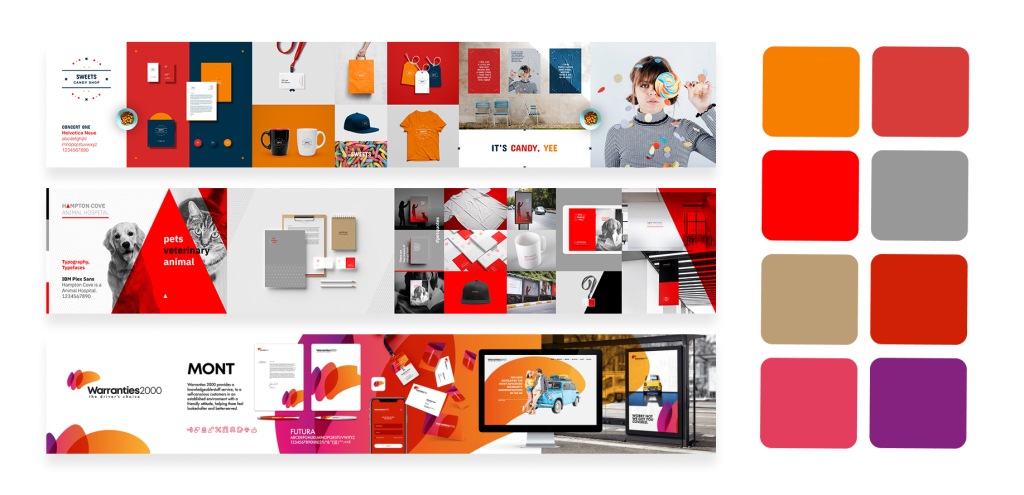
Tool Recommendation: Use Adobe Color or Coolors to generate palettes.
3. Best Practices for Using Colors in Web Design
✅ Prioritize Readability – Ensure text contrasts well with the background (e.g., dark text on light backgrounds).
✅ Use Colors Strategically – Highlight CTAs (e.g., red/orange for buttons).
✅ Stay Consistent – Match brand colors across all pages.
✅ Avoid Overloading – Too many colors can distract users.
✅ Test for Accessibility – Check contrast ratios for readability (use WebAIM Contrast Checker).
4. Real-World Examples of Effective Color Use
- Spotify → Green accents on dark background (energetic yet sleek)
- Airbnb → Coral-red for CTAs (friendly & inviting)
- Slack → Purple-dominated palette (creative & modern)
Conclusion
Colors are more than just decoration—they shape user perception and drive engagement. By understanding color psychology, selecting the right palette, and following best practices, you can create a visually appealing and high-converting website.
Need help choosing your brand colors? Start experimenting today!
What’s Your Favorite Color Scheme?
Drop your thoughts in the comments below! 🎨✨
Would you like a deeper dive into color accessibility or trending palettes? Let us know!